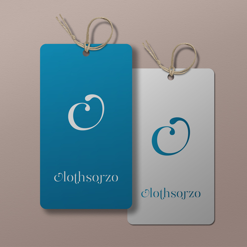
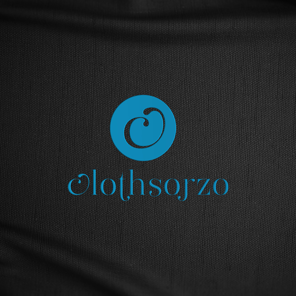
Clothsorjo Logo & Brand Identity Logo Design

As a specialist in the design of logos and brand identities, I am aware of the value of giving a company a compelling and enduring visual identity. Today, I’d like to demonstrate my skills by outlining the creative process and ideas that went into developing the Clothsorjo logo and brand identity.
The main objective of the Clothsorjo brand is to become recognized as a cutting-edge, modern clothing line that appeals to both men and women. To do this, we set out on a thorough design journey that involved a lot of investigation, careful planning, and painstaking execution.
Designing a logo:
The Clothsorjo logo captures the essence and character of the company. In order to grab the target audience’s attention and leave a lasting impression, we attempted to achieve a balance between elegance, modernism, and approachability.
An elegant, minimalist font that was specially created for the logo shows both sophistication and timelessness. For harmony and legibility, the letters are carefully spaced apart.
Lowercase “Clothsorjo” is used in the brand name to convey a welcoming and modern vibe. Lowercase lettering also makes it easier for the accompanying graphic element to be integrated, creating a more unified and appealing visual identity.


Brand Recognition:
In addition to the logo, we created a thorough brand identity system that conveys Clothsorjo’s key beliefs and differentiators. This system consists of color schemes, typographic rules, picture styles, and supplementary visual components.
- Color Scheme: The color scheme we chose for Clothsorjo combines warmth, modernism, and refinement. The dominant hue is a rich, deep navy blue that screams confidence and style. The brand’s visual identity is balanced and made more adaptable with a secondary color palette that consists of gentle grays, creams, and other neutral tones.
- Typography: In addition to the typography for the specially created logo, we also carefully selected a typographic system for Clothsorjo. As the primary typeface for headings and body text, we chose a contemporary and adaptable sans-serif font to ensure legibility across many mediums.
- Graphic elements and imagery: Clothsorjo’s imagery style embodies a sophisticated and modern feel. We chose images that are of the highest quality and visually attractive and that present the clothing line of the company in a lifestyle setting. These pictures appeal to the target market while showcasing the superiority, style, and adaptability of Clothsorjo’s products.
Along with the logo, we also created a distinctive visual element based on the letter “C” in the company name. When used alone or as a supporting component in different marketing assets, this tasteful and understated design adds visual interest and functions as a recognizable symbol of the company.
The brand identity we developed for Clothsorjo and its logo successfully convey the spirit of the company and its intended market. The visual identity conveys a contemporary, attractive, and friendly attitude through the use of clear typography, an elegant color scheme, carefully chosen photography, and supplementary graphic components.
Clothsorjo is prepared to have a long-lasting impact on the fashion sector, draw a devoted customer base, and distinguish itself from its rivals by developing a consistent and distinctive brand presence.
As a specialist in creating logos and brand identities, I take satisfaction in developing powerful and aesthetically attractive solutions that complement a company’s mission and core principles. The Clothsorjo logo and brand identity are an excellent example of my dedication to producing appealing design solutions that are memorable.
Latest Client Review
Absolutely wonderful service. From start to end was very persevering and their inspired mind create it easy to work with their and get the effects we were looking for. Thanks and cannot endorse enough!
