Bluebell Logo and Brand Identity Logo Design

Creating a compelling logo and brand identity is essential for every organization, whether it is a business or a school. This professional guide delves into the craft of developing a classic Bluebell logo Design that captures a school’s identity and connects with its target market. We’ll discuss important factors, components, and principles that lead to a great logo design, drawing on our significant experience.




- Knowing the Bluebell Brand: It’s important to know the Bluebell brand before beginning the logo design process. The school’s beliefs, culture, and educational goals should all be reflected in the logo. You may understand the school’s distinctive identity and visually translate it by conducting in-depth research and speaking with important stakeholders.
- Adopting Symbolism: A Bluebell logo design can use symbolism to communicate meaning and arouse feelings. Books, a graduation cap, or an open door can be used to symbolize knowledge, academic accomplishment, and opportunity. It’s crucial to achieve a balance between a classic emblem and a cutting-edge design.

- Color Scheme: Choosing the right color scheme is essential for the Bluebell logo. Blue is an obvious option because it is the dominant color linked to trust, stability, and intelligence. A secondary color that reflects the character of the school, such as warm hues for creativity or cool tones for peace, may be used to enhance it. Keep the color palette simple to ensure adaptability and durability.
- Typeface: A Bluebell logo’s typeface should be carefully chosen to convey a sense of professionalism and intellectual competence. The best typefaces are clear, readable, and classic, yet adding special letters can give them a little extra character. To produce a unified visual depiction, strike a balance between grace and clarity.
- Visual Components: The Bluebell logo design can be distinguished by utilizing distinctive visual components. Think about using depictions of bluebell flowers, architectural themes, or components that signify development and success. These components ought to work together harmoniously to create a distinctive and eye-catching brand.

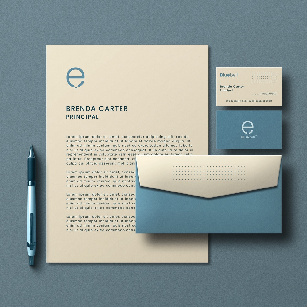
- Scalability and Adaptability: A well-designed Bluebell logo should be adaptable and adjustable to work with a range of sizes and media. Make sure it keeps its effect when reduced for uses like stationery, internet platforms, or promotional items. Maintaining brand consistency in various contexts requires adaptability.
- Harmony and Balance: It’s crucial to design a well-balanced composition for the Bluebell logo. The placement of the components must be aesthetically appealing and harmonious. Aim for a simple design that will make the logo instantly identifiable and memorable.
A thorough grasp of the school’s brand, basic principles, and intended audience is necessary while designing the Bluebell logo. A timeless and alluring logo can be created by infusing symbolism, picking the right color scheme, using typography skillfully, and including distinctive graphic components. Always keep in mind that an effective logo design conveys the essence of the institution, produces a lasting impression, and represents academic brilliance.
Latest Client Review
Absolutely wonderful service. From start to end was very persevering and their inspired mind create it easy to work with their and get the effects we were looking for. Thanks and cannot endorse enough!
