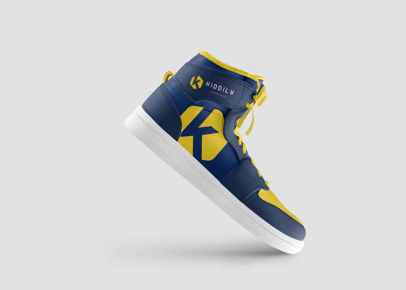
K Letter Logo and Brand Identity Logo Design

In terms of branding, a company’s logo acts as its public face, encapsulating its essence and creating a distinctive visual identity that appeals to its target market. It is essential to create a design that is memorable, distinctive, and evocative of the brand’s values and personality when creating a logo containing the letter “K.” In this post, we’ll look at professional advice for designing a K-letter logo and brand identity that people will remember.
- Understand the brand: Take the time to carefully grasp the brand you are working with before beginning the design process. Investigate the company’s target market, competitive environment, and key values. Learn about the brand’s personality, unique selling points, and intended brand positioning. This knowledge will act as a strong foundation for developing a K-letter logo that truly captures the soul of the company.
- Emphasize simplicity: Put a focus on simplicity. When creating an effective logo, simplicity is essential. Concentrate on developing a simple, memorable K-letter logo that is clear and uncomplicated. Reduce complexity and additiveness in the design to make it more efficient. A straightforward logo that is handled successfully has the power to make an impact and last over time.


- Balance uniqueness and readability: While pursuing uniqueness is important, maintaining readability is equally crucial. Create a unique logo that is readable at multiple sizes by experimenting with different K letter forms, typefaces, and design elements. Strike a balance between artistic experimentation and making sure that the target audience can quickly understand the logo.
- Play with typography: The K-letter logo’s overall effect can be greatly influenced by the typeface used in it. Find a typeface that fits the personality of the brand by experimenting with a selection of them. To add a hint of originality, think about modifying the letterform or inserting subtle design elements within it. Even if you choose a more stylized approach, keep in mind that readability is still important.
- Colors and symbolism: Consider carefully choosing colors that reflect the brand’s values, arouse the desired feelings, and appeal to the target market. To discover the ideal balance, experiment with various color palettes and combinations. Symbolism or visual components that represent the brand’s basic principles or product offerings should also be included. The K-letter logo can gain depth and meaning by making subtle allusions or using abstract representations.

- Scalability and flexibility: Ensure that the K-letter logo retains its integrity and readability when used on different devices and in a variety of sizes. To ensure the logo can be scaled, test it in a variety of formats, from tiny app icons to enormous signage. A flexible logo that adapts naturally to many circumstances will guarantee brand awareness and consistency.
- Seek feedback and iterate: Collaborate closely with the stakeholders in the brand throughout the design process and solicit feedback. Design iterations should be based on constructive criticism and the brand’s mission. Before settling on the final design, testing the logo with a focus group or the intended audience might yield insightful information.
A thorough grasp of the brand, striking a balance between simplicity and originality, thoughtful typographic selections, deliberate use of color and symbolism, scalability, and iterative refinement are all necessary for creating an engaging K-letter logo and brand identity. By using this professional advice, you can design a visually attractive and powerful logo that accurately communicates the brand’s identity and connects with its target market. Keep in mind that a well-designed K-letter logo has the potential to make an impact and support the development of the company.
Latest Client Review
Absolutely wonderful service. From start to end was very persevering and their inspired mind create it easy to work with their and get the effects we were looking for. Thanks and cannot endorse enough!
