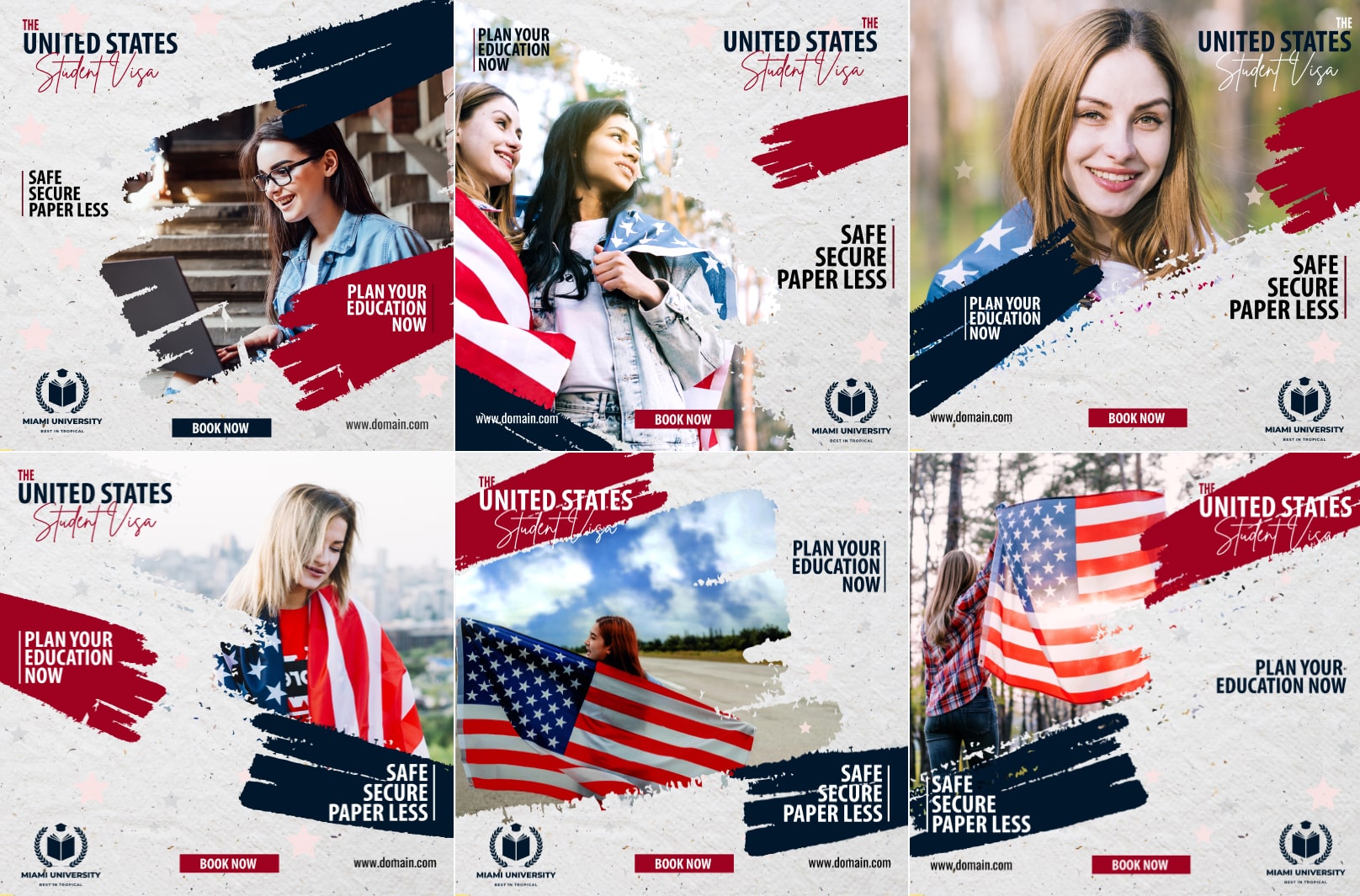
6 Study & Immigration Visa Banner Design Ideas to Inspire You

Study & Immigration Visa Banner Design Ideas
Welcome to our Office Banner Design Services! We are a team of professional graphic designers and marketing experts who specialize in creating custom office banners to help businesses stand out from the competition. Our banners are designed to be eye-catching, memorable, and informative, helping to promote your business and services. We provide full-service banner design services, from concept to completion, including logo and text design, color selection, format selection, and installation. With our expertise, your business will be sure to make a lasting impression with high-quality visa banner design that is sure to get you noticed. Contact us today to learn more about our office banner design services and get started on creating your own custom banner!
Full Design Set Here


6 Visa Banner Design Tips
Visa banner designs are an effective way to grab the attention of potential customers and increase brand visibility. When designing a Visa banner, there are certain elements you should keep in mind to make sure your banner stands out and effectively communicates your message. Here are six Visa banner design tips to help you create an eye-catching banner that will get noticed:
1. Keep it simple and clear
When it comes to banner designs, less is often more. You want your message to be clear and easy to understand, so keep your design simple and free of clutter. Use a clear and easy-to-read font and limit the amount of text to only what is essential. You don’t want to overwhelm viewers with too much information, as this can cause them to lose interest and move on.
2. Use high-quality images
The images you use in your banner should be of high quality and relevant to your message. Choose images that are visually appealing and reflect the message you want to convey. Make sure the images are clear and not pixelated, as this can make your banner look unprofessional.
3. Make it visually appealing
Your banner should be visually appealing and draw the viewer’s attention. Use contrasting colors to make your message stand out, and make sure your design is visually balanced. Avoid using too many different colors, as this can make your banner look chaotic and cluttered.
4. Be consistent with branding
Consistency is key when it comes to branding. Make sure your banner design is consistent with your brand’s overall look and feel. Use the same color scheme, font, and imagery as your other marketing materials to create a cohesive and recognizable brand identity.
5. Make it relevant
Your banner should be relevant to your target audience and the message you want to convey. Make sure your design and messaging align with your target market and the benefits of your product or service. For example, if you’re advertising a credit card, highlight the benefits that are most relevant to your target audience, such as cash-back rewards or travel points.
6. Consider the placement
The placement of your banner is just as important as the design itself. Make sure you choose a location where your target audience is likely to see it. For example, if you’re advertising a credit card, consider placing your banner near an ATM or in a busy shopping center. Also, make sure your banner is the right size for the location and can be easily seen from a distance.
Creating an effective Visa banner design is a key element in successful marketing. By keeping these six tips in mind, you can create a banner that stands out, communicates your message clearly, and drives the results you’re looking for. Remember to keep it simple, visually appealing, relevant, and consistent with your brand, and consider the placement carefully to ensure maximum visibility. With these tips, you can create a Visa banner design that gets noticed and delivers results.
